Typographic poster
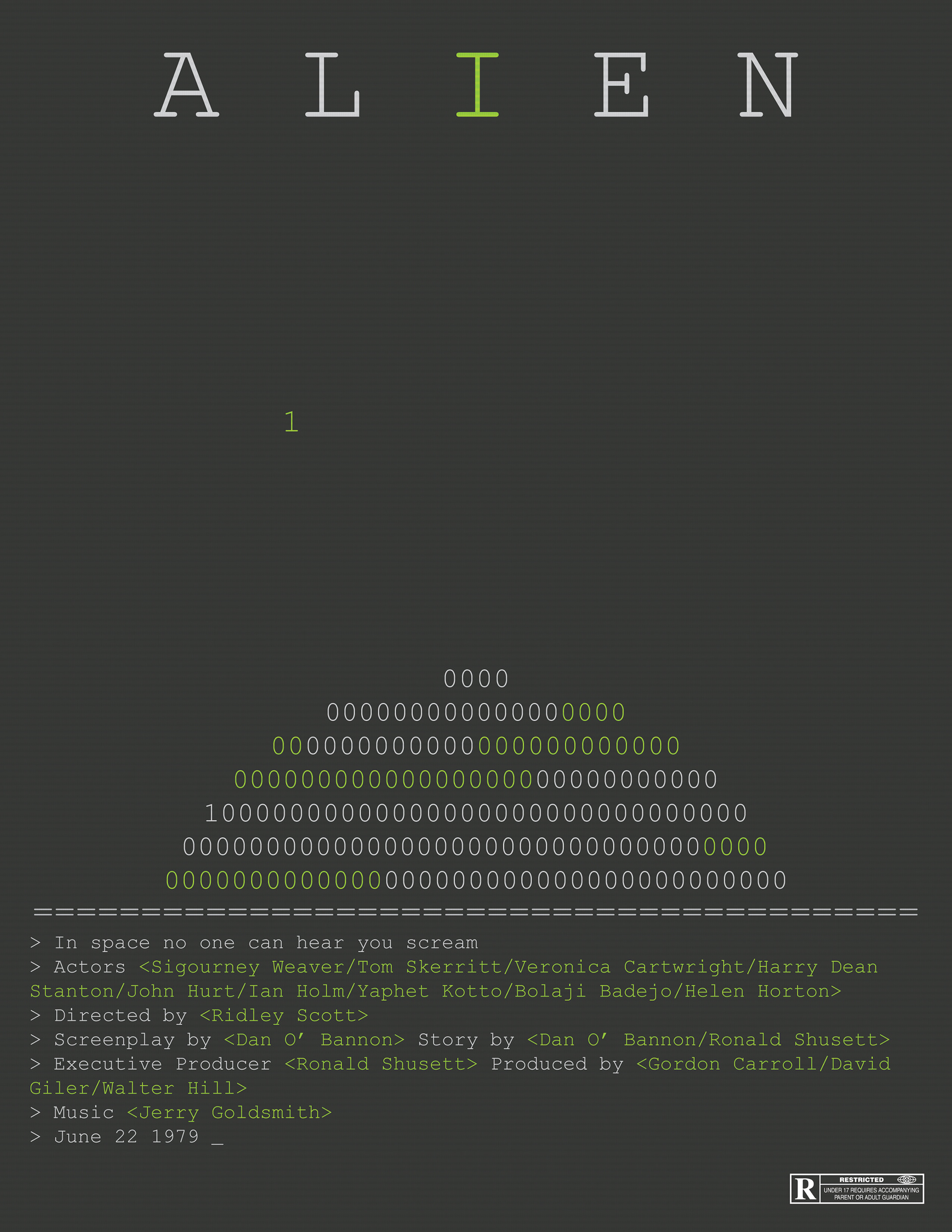
For my first poster, I wanted to convey the sense of loneliness and suspense present throughout the movie. I wanted to also try to work in the retro aesthetic of the technology in the movie.
To convey the sense of suspense in the movie, I used type to create a planet peeking above the footer, using color to add texture. On the planet I added a single one to represent where the Alien came from, and in the space above the planet, I put another one to represent the Nostromo. I isolated the second one, alone in space to show that they were alone and no one was going to help them. The empty space around it creates a sense of mystery and dread.
In order to create the retro aesthetic of the movie, I chose to create my poster as if it was a block of code. The footer is formatted in a way similar to code, with each line representing a command put into the computer. The font I used a similar font used by windows cmd prompt, creating even more tie in with the code.
I used the same font for the title on my first poster, I used wide kerning as well as large size to create hierarchy along with it’s isolation.
Expressive Poster
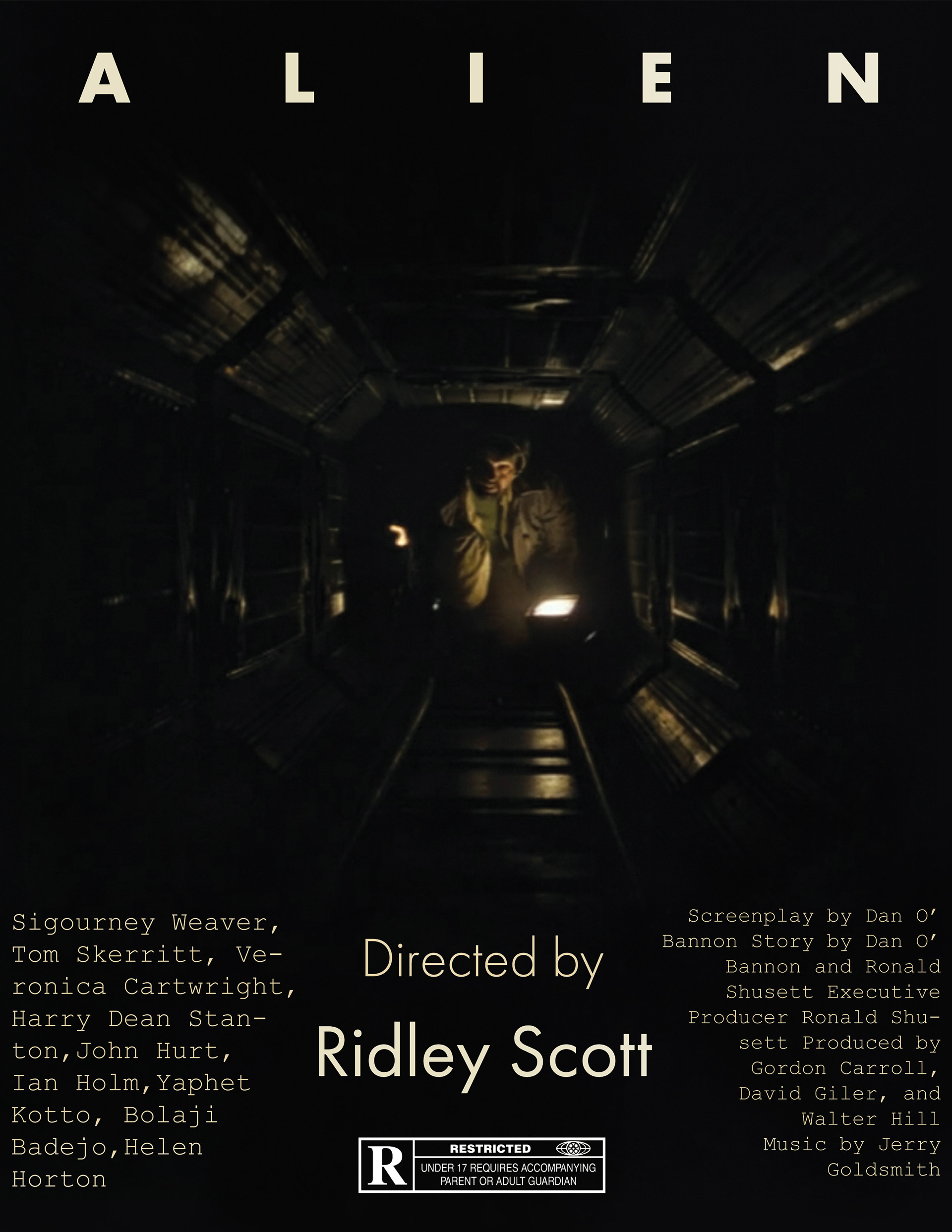
When I first was making this poster, I was planning on making it show the alien through some sort of frame such as the slits in a locker, but there was a problem with this, there are no scene where Ripley hides in a locker. This made the idea hard to tie into the movie.
I then decided to go with an alteration of my second idea which was to utilize a single light source to dimly light up the scene and create mystery, as the viewer doesn’t know what’s around the corner.
To make the poster feel dynamic, I utilized the lines created by the walls to create frames for the footer text. This allowed me to separate the footer into 3 distinct areas. The middle area is used to show the most important elements, the director, and the age rating. The left area is used to show the main actors in a slightly larger font than the text on the right.
For the title Text, I decided to keep the movie’s iconic style, with the large kerning. The space between the letters felt as though it tied into the mystery and suspense I was trying to create.
I also took the poster into Photoshop at the end to add some texture and depth to the type.